LAUNCHED
Hyundai Motor Group
Hyundai’s first global design guide & IONIQ 6 website
IONIQ 6 Website

MY ROLE
Fulltime UX Designer
TEAM
2 UX Designers, 3 Developers, 2 Visual Designers, 3 3D Artists
DURATION
Jan - July 2022
MY SCOPE
Designed a guideline, iterated on feedback from local branches, improved accessibility related guidelines, and directed UX design of a website.
IMPACT
Distributed to all of Hyundai’s 56 branches worldwide, resulting in 350% increase in unique visitors and selling 375,113 units.

10-second Summary
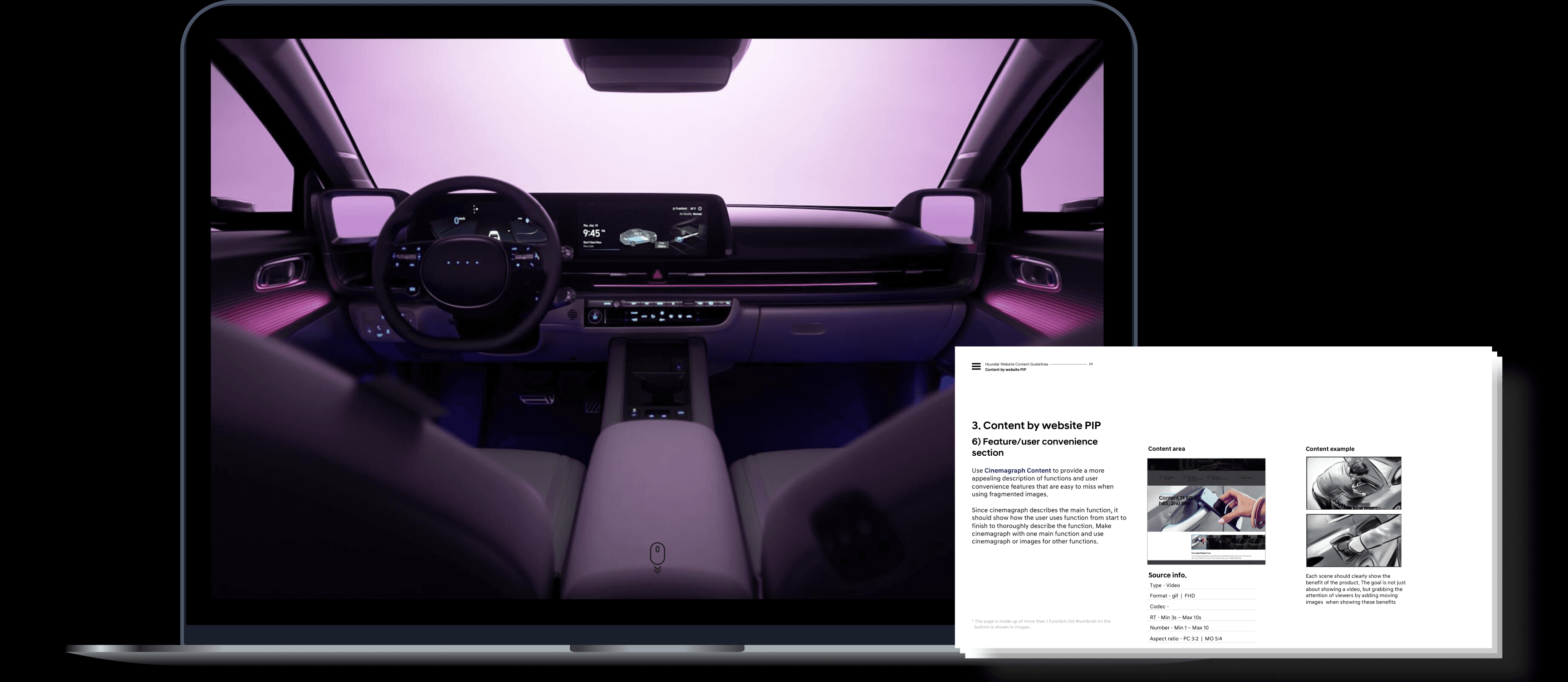
This case study involves two projects: developing Hyundai Motor Group's first-ever website design guideline and implementing it on the IONIQ 6 website.
Project 1. Design Guideline
Problem
Hyundai Motor Group’s websites lacked a cohesive user experience across countries, featuring static designs that inadequately showcased vehicle interiors and exteriors, jargon-heavy language, and poor accessibility, violating global accessibility laws.
Solution
I designed a global design guideline, incorporating parallax scrolling for a 3D view of the product, simplified headlines for better understanding, and adherence to WCAG accessibility standards.
Impact
The new guideline was implemented in 56 countries, earning high praise from the chairman, leading to a new project of designing IONIQ 6 website based on the guideline.
Project 2. IONIQ 6 Website
Goal
To increase online sales due to the pandemic, I needed to create an immersive showcase of the car's interior and exterior, visually emphasize the product's signature dual lighting, and explain the driving assistance features in a way that anyone could understand.
Solution
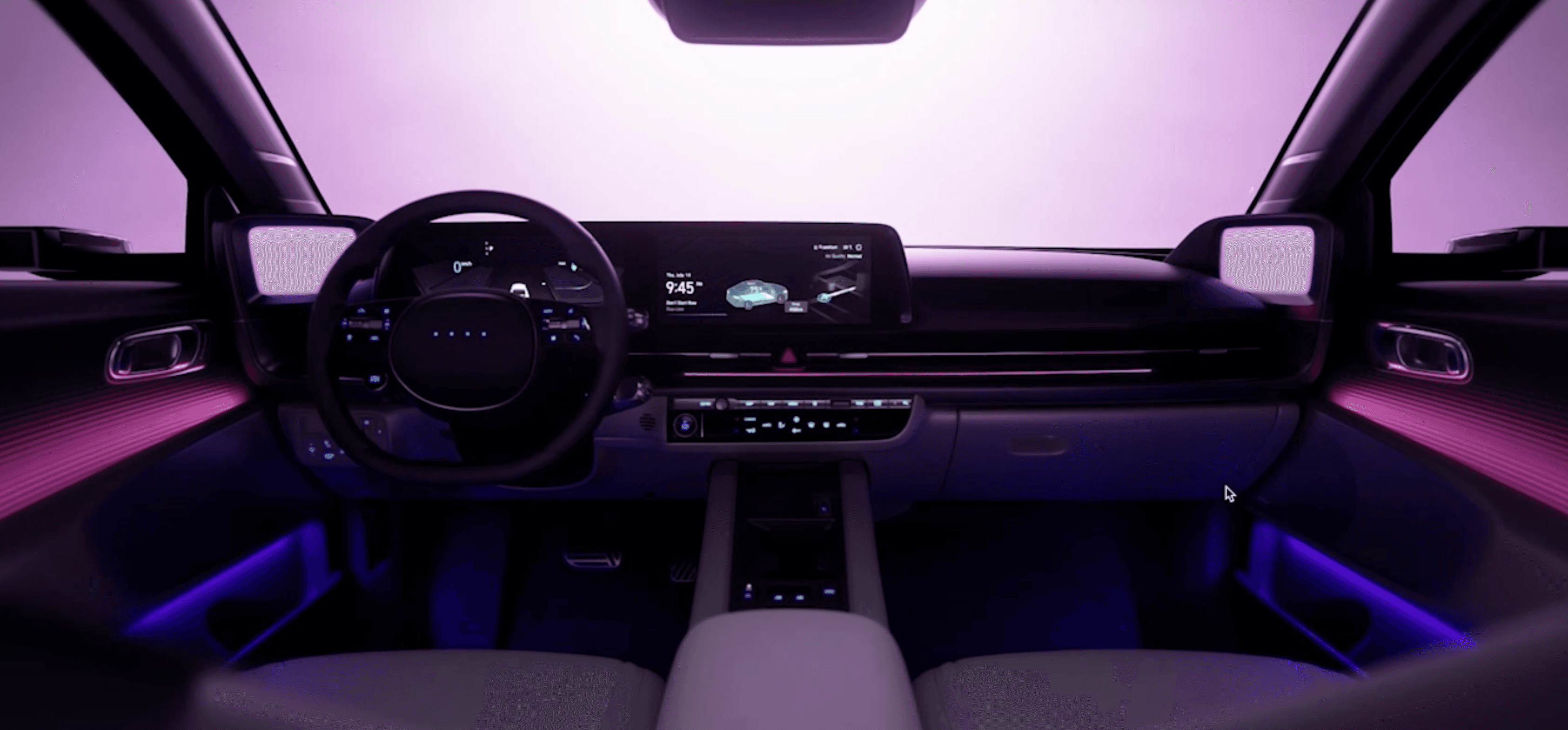
Adapting a guide I had previously created, I used parallax scrolling to showcase both the exterior and interior of the car, using dual-lighting key colors, and animating the driving assistance features to help consumers understand them.
Impact
It led to 350% increase in unique visitors and 375,113 units sold.
Solution
Immersive parallax scrolling revealing the vehicle's interior and exterior
Guideline

IONIQ 6 Website

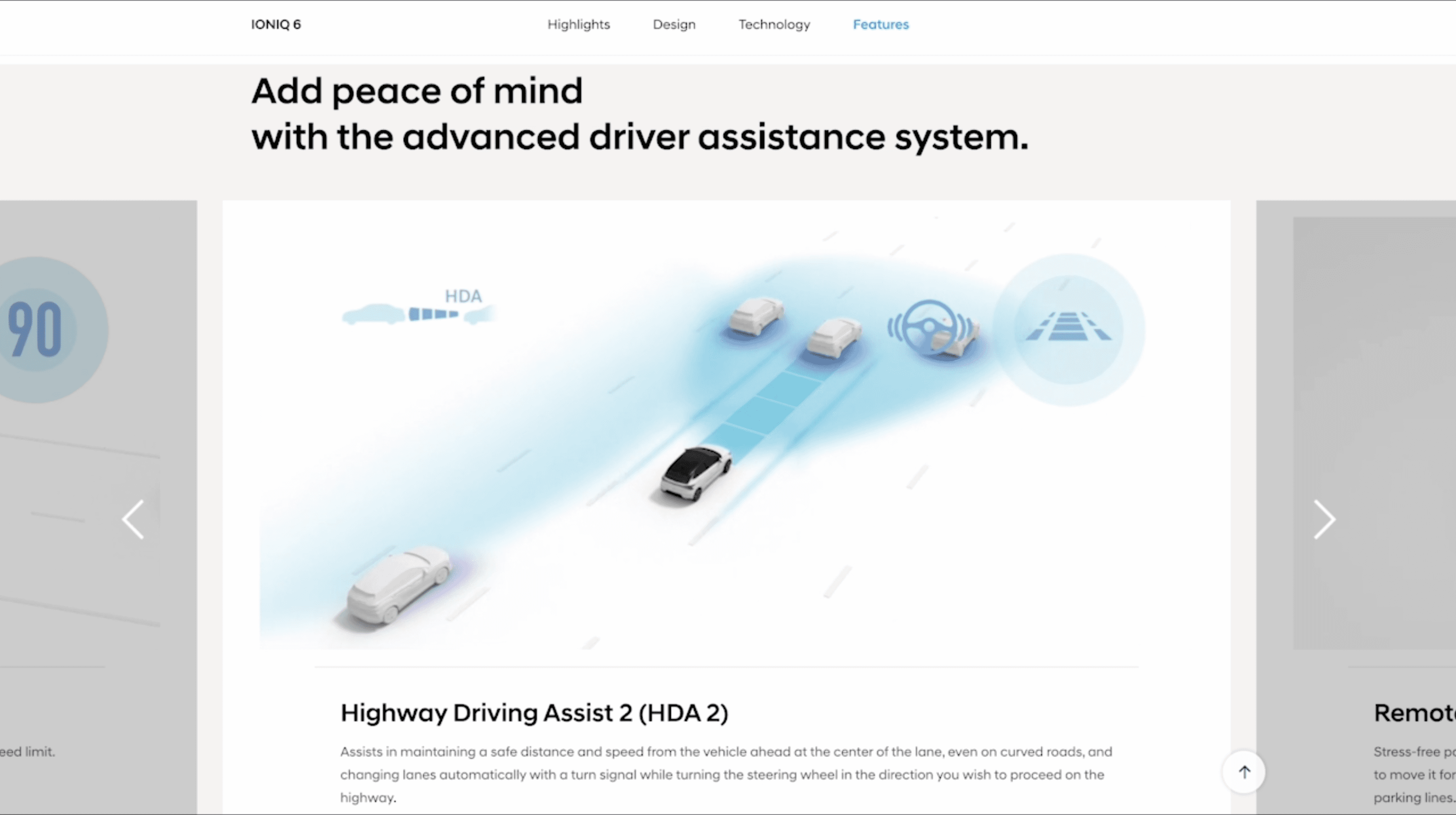
Easy-to-understand explanations and animations for autonomous driving technology
Guideline

IONIQ 6 Website

Alternative texts for all images for accessibilty
Guideline

IONIQ 6 Website

challenge
Solution

Goal
How might we define the voice of Hyundai making it intuitive and trendy while still maintaining a trustworthy image and delivering accurate information?
Comparison
We chose parallax scrolling after considering other forms.

Short-from video

The short-foam video was too casual and didn't fit the traditional image of a car and the modern world, where trust is paramount.

Parallax scrolling

It's important to actually see the inside and outside of a car when looking at it, and parallax scrolling shows the car from the inside out intuitively, which met Hyundai's needs by providing an intuitive experience.

Augmented reality

Most countries lack reliable network coverage for seamless AR use, and many users lack the necessary phone capabilities. The guidelines required content to be universally applicable to Hyundai locations around the world.
Guideline Content

Parallax scrolling
I applied an interaction to the product's hero image that allowed users to see the car in three dimensions as they scrolled. This allowed users to explore the product from all angles and maximize the user experience.
Backstory
Hyundai's client took Apple's AirPods site as an example. I took the parallax scrolling interaction, which allows users to see the product in three dimensions as they scroll, and adapted it to fit Hyundai's image.

Cinemagraph
I applied cinemagraph to an image showing a feature of a product, where one element of the image moves continuously to immerse the user.
Backstory
Since Hyundai is offering a contactless purchase experience globally, I wanted to give users an immersive experience that felt like they were actually seeing the product without having to look at it, so we borrowed from microinteractions to create a realistic experience.

User friendly writing
I crafted the guidelines so that the headings and feature descriptions are intuitive and easy to understand, even for someone with no knowledge of cars.
Backstory
Before, a few professional terminologies were contained in writing, making it hard to understand. However, anyone can easily understand descriptions after applying a user-friendly writing style.
Feedback from Local Branches
Based on feedback from local offices worldwide, I revised the guideline, aligning accessibility with global standards.
After learning about the legal requirements for accessibility in Canada, I revised our guidelines to comply with global accessibility laws. This experience reinforced the importance of inclusivity and adaptability, reminding me of the value of continuous improvement.
challenge
Solution

Revised Guideline Content

Pause button for GIF files and videos
If the moving or scrolling content 1) plays automatically, 2) is more than 5 seconds long, and 3) is placed in parallel with other content, you must provide the feature to pause, stop, or hide it.
Alternative texts for all images
It must provide alt text for all images.

Guideline
Feedback from Executives
Highly praised by executives, leading to the Ioniq 6 website design project.
This was the first global guideline for websites in Hyundai's history, and it received rave reviews from executives. As a result, we were asked to design a website using the guidelines for the global pages of the Ioniq 6, which launched four months after the guidelines were created.
Website design
I applied the guidelines to the IONIQ 6 website, creating a sleek design and directing videos to match the latest electric car's style.
To get additional information, refer to this website.

Website design
Immersive parallax scrolling shows the inside and outside of the vehicle in three dimensions.
Cinemagraphs that immerse users.
Easy-to-understand explanations and animations for autonomous driving technology.
We used animations to make it easy for people who don't understand autonomous vehicle technology to understand, and we avoided using jargon and used simple UX writing.
Impact
It standardized UX design for mobility experience, and distributed to 56 local branches worldwide.
350% increase and selling 375,113 units.
It resulted in an astounding 350% increase in unique visitors and selling 375,113 units.
Takeaway
Communication is key, especially working on a big project.
This project involved many stakeholders, including clients such as Hyundai Motor Group in Korea, photographers, 3D artists, and local Hyundai branches in Canada. A minor miscommunication could have wasted time and effort and deteriorated the quality. I realized how critical communication is. Since then, I have written emails and messages clearly as they can be with bullet points and sent an email with discussed details after meetings. It eased discussions with various stakeholders.
Accessible design for an international webpage is mandatory, not an option.
Not to mention global societies recommend inclusive designs; many countries comply with accessibility guidelines by laws, just as Canada, Israel, and Sweden do. I realized that designing a webpage for international markets has to be universal. Since Korean websites rarely consider accessibility, it impressed me. Since then, I've formed a habit of inclusive design.

